The emergence of ‘Responsive Website Design’ is a paradigm shift. It has made businesses, website owners and designers go back to the drawing board.
More than 90 percent people use their smartphones regularly for activities such as texting, internet browsing, playing games, social networking, reading books etc. These statistics suggest that approximately 80 percent of the world population has a mobile phone nowadays. Due to busy lifestyle, people are really pressed for time nowadays and they want to do everything on the go they used to do on their computers and laptops.
It might interest you to know that more than 88 percent of smartphone users use their phones throughout the day. There are not only smart phones and iPhones there are basic phones too. Android tops the chart with more than 46 percent of smart phones users being android users. I-phone is second on the list with more than 28 percent smartphone users being I-phone users. These statistics clearly annotate that a website incompatible with mobile viewing has absolutely no chances to survive in the long run. It is not possible to have 2, 3 or 4 different websites for desktops, smartphones, laptops, tablets etc.
It might not be impossible to have 4 different websites for all these platforms, but it is impossible to pull it off with duplicate content on multiple websites. So what’s the solution and how does it work? Responsive Website Design (also known as RWD) is your answer.
‘Responsive Website Design‘ is an approach that caters to various users’ needs by being responsive to screen size, platform and orientation. This suggests optimum usage of flexible grids, layouts, images and CSS media queries without failing on resolution, scripting abilities and size of images.
What points should be kept in mind while creating a responsive web design?
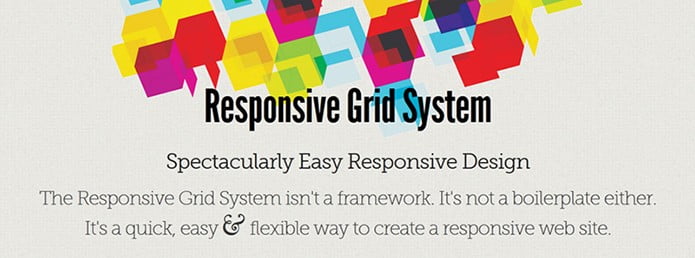
Flexibility: Grid flexibility is the pre-requisite for any good responsive web design. It accommodates for the browsers that require the website to be flexible. Define your custom parameters for spacing, columns etc. Spacing and size are the 2 most important components to focus upon.
Images Images should be responsive and should acknowledge your grid. To cut down slow loading times use images of manageable size. Some simple scripts like that of Robot Ninja automatically resizes the image.
Media queries Media queries is one of your best friends in terms of responsive website design. Media queries deal with colour, screen resolution as well as orientation. Media queries allow to create websites that is flexible to all the mediums.
To know the ‘Benefits of Responsive Website Design’, visit our special editorial blog citing different benefits of Responsive Web Design